Charts & Analytics
Overview
Section titled “Overview”The analytics section provides a clear picture of your finances through four types of charts.
How to Open
Section titled “How to Open”In the Expenses section, click the charts icon (diagram) - the analytics page will open.
Chart Types
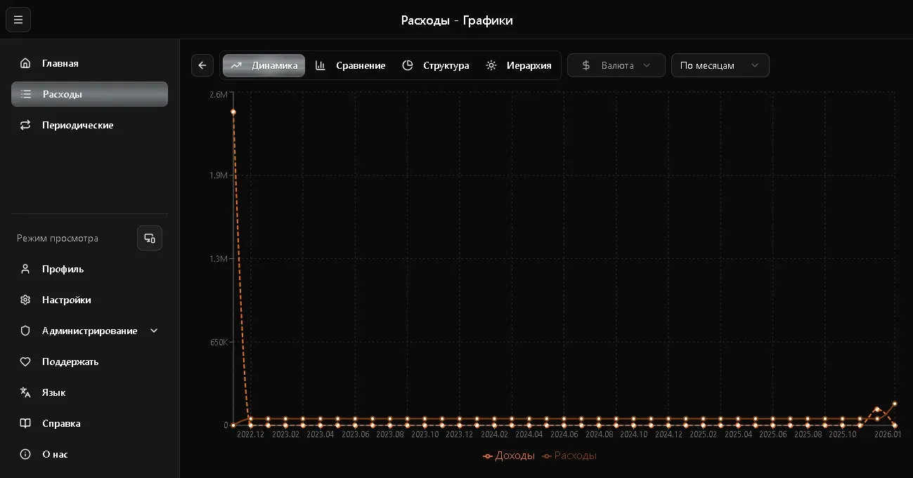
Section titled “Chart Types”Line Chart
Section titled “Line Chart”Shows expense dynamics over time - how your spending changed day by day, week by week, or month by month.
Useful for:
- Tracking expense trends
- Comparing different periods
- Spotting spending spikes
Bar Chart
Section titled “Bar Chart”Shows expense totals by period as bars. Easy to compare how much you spent in different months.
Pie Chart
Section titled “Pie Chart”Shows distribution by category - what percentage of total expenses each category accounts for.
Useful for answering: “Where does most of the money go?”
Sunburst Chart
Section titled “Sunburst Chart”A hierarchical chart showing the nested structure of expenses. Inner circle - categories, outer ring - details.
Grouping
Section titled “Grouping”For line and bar charts, grouping is available:
| Grouping | Description |
|---|---|
| By days | Each day separately |
| By weeks | Weekly totals |
| By months | Monthly totals |
| By years | Yearly totals |
Select the desired grouping in the dropdown above the chart.
Currency Filter
Section titled “Currency Filter”Above the charts is a currency filter - if you have records in multiple currencies, select the one you want to display.